As promised, we return to consider the aesthetic part of digital workplace usability.
Easy to use workplace should also be comfortable and beautiful. It is not true that informative page (homepage, FAQ page, article page etc.) should exclude all additional information except the explicit one.
A huge part of communication takes an implicit semantic sense of the page generally. All icon and color is a powerful sign that can destroy all your efforts if picked up inadvertently. Use all sources to convince users.
Design
The design is the most unstable part of the intranet development. The trends are changing all the time.
But we have some tips for you, which are useful for every trend
- Always follow new trends in design.
- Apply these trends carefully, improve existing design but don’t rebuild it from the very beginning every time.
- Strive for simplicity, it is always the trend.
- Use popular sites for designers for inspiration.
- Avoid using video/audio autostart
- Don’t use pop-up modal windows
- Also, avoid using scrolling lines like a stock ticker and any other animation on your homepage.
- Follow the brand book.
- If you are a designer, you should consider all the particular qualities of intranet platform when making the mockup.
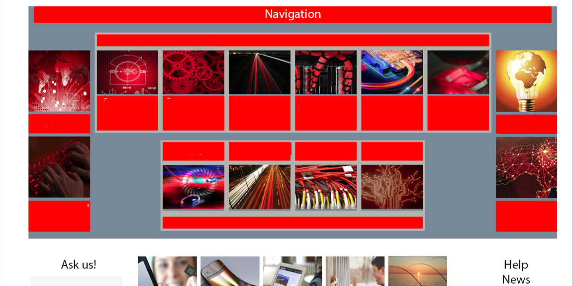
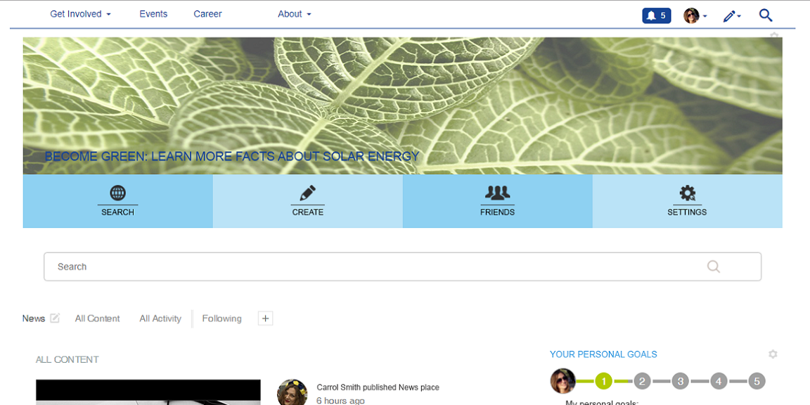
Here you can see bad and good results of the brandbook following
No: Yes:


Content
Our goal is to create content that will make people want to read it. So let’s think about 5 internet articles, which you remember best.
We will need some key points to describe your favourite articles:
- the amount of text
- text design (headings, fonts, huge paragraphs presence)
- information about author (who are you and why do you think you are good in this field?)
- graphic part (images, videos, highlighters)
- understandable speech
While you are thinking about all these parts let me tell you more about them.
Try to avoid “longreads” if you want people to read your articles. It is especially important if the article is a part of global corporate news and you need everyone to read it.
Use different text styles to highlight the information. But don’t use too many styles elements in one post.
NO:
 Add to your profile as much information as you can. People want to know more about the credibility of the text they read.
Use images, GIFs and videos to enhance text effect. If you have good image to attract attention to the article, use it!
YES:

YES:
 Try to avoid using too long and hard to understand sentences. It is important to communicate with all users through the text, not only with existing readers.
NO:

Try to hide outdated content. It is very important if you deal with departments database. People should see only valid information but have access to archive.

Availability
 This is one of the most important for CEO and top managers side of intranet usability.
Usually, CEOs are very busy people so they use many devices at a time. Our goal is to provide all needed features to make intranet available for all users with all the devices.
Here are some useful pieces of advice for availability:
– Intranet must work stable and properly.
– Users should have access to the digital workplace from any location (office, home, public places, country of residence, abroad) and with any device (desktop, mobile devices).
– A mobile app is a great idea, especially for the field stuff. Obviously, developing a mobile app is expensive. Some platforms offer a ready-made solution, that is a great option for fast and cheap launch.
– The access should be simple. Credits must not change often. Use single sign-on.
 Mobile version of the intranet should have a simple design with minimum elements. It will work better for all types of devices, even with a small display.
Functionality
All functionality should be familiar to users. Try to use well known visual parts for your intranet. It will help users get used to the intranet easily. Beautiful design is not everything, it will be modified many times after launch. So it will be very useful if you do some pre-launch user experience testing. You can be sure, you’ll want to modify even your favorite parts of design.
Don’t create all new features if you want people to use digital workplace from the very beginning.

Remember! Place key functions on one-click distance. Try to balance the number of one-click functions and don’t place more than 3 menus on the page (accept header menu).


